Responsive Web Design: What It Is and How To Use It ...

Internet usage on mobile phones and tablets is increasing every day and there are now more smartphones being sold in the world than traditional PCs, with sales of tablets quickly catching and expected to overtake PC sales in the near future. More than a third of people browsing the web now do so on a smartphone, with many of these using only their mobile phone and more than half of internet searches using a smartphone are people searching for local services and companies.
Mobile Friendly
Have you asked yourself, “What is responsive Web design?” Responsive Web design is an approach whereby a designer creates a Web page that “responds to” or resizes itself depending on the type of device it is being seen through. That could be an oversized desktop computer monitor, a laptop, a 10-inch tablet, a 7-inch tablet, or a 4-inch smartphone screen.
Responsive Web design (themes, skins) has become one of the hottest trends in 2013. This is due in part to the growth of smartphones and other mobile devices. More people are using smaller-screen devices to view Web pages.
What Does Responsive Web Design Look Like?
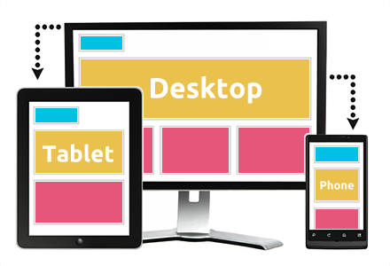
The purpose of responsive design is to have one site, but with different elements that respond differently when viewed on devices of different sizes.
Let’s take a traditional “fixed” website. When viewed on a desktop computer, for instance, the website might show three columns. But when you view that same layout on a smaller tablet, it might force you to scroll horizontally, something users don’t like. Or elements might be hidden from view or look distorted. The impact is also complicated by the fact that many tablets can be viewed either in portrait orientation, or turned sideways for landscape view.
On a tiny smartphone screen, websites can be even more challenging to see. Large images may “break” the layout. Sites can be slow to load on smartphones if they are graphics heavy.
However, if a site uses responsive design, the tablet version might automatically adjust to display just two columns. That way, the content is readable and easy to navigate. On a smartphone, the content might appear as a single column, perhaps stacked vertically. Or possibly the user would have the ability to swipe over to view other columns. Images will resize instead of distorting the layout or getting cut off.
The point is: with responsive design, the website automatically adjusts based on the device the viewer sees it in.
How Does Responsive Web Design Work?
Responsive sites use fluid grids. All page elements are sized by proportion, rather than pixels. So if you have three columns, you wouldn’t say exactly how wide each should be, but rather how wide they should be in relation to the other columns. Column 1 should take up half the page, column 2 should take up 30%, and column 3 should take up 20%, for instance.
Media such as images is also resized relatively. That way an image can stay within its column or relative design element.


Related Issues
Mouse v. touch: Designing for mobile devices also brings up the issue of mouse versus touch. On desktop computers the user normally has a mouse to navigate and select items. On a smartphone or tablet, the user mostly is using fingers and touching the screen. What may seem easy to select with a mouse, may be hard to select with a finger on a tiny spot on a screen. The Web designer must take “touch” into consideration.
Graphics and download speed: Also, there’s the issue of graphics, ads and download speed. On mobile devices, it may be wise to display fewer graphics than for desktop views so that a site doesn’t take forever to load on a smartphone. Larger ad sizes may need to be exchanged for smaller ads.
Apps and “mobile versions”: In the past, you might have thought about creating an app for your website — say an iPad app or an Android app. Or you would have a mobile version specifically for BlackBerry.
But with so many different devices today, it’s getting harder to create apps and versions for every device and operating platform. A responsive design that is flexible enough to be viewed on multiple devices just makes sense.
Why Small Businesses Need to Switch to Responsive Web Design
More people are using mobile devices. A recent study found that 45% of adults own a smartphone and 31% own a tablet computer. Check your traffic and you might just be shocked at how many visitors are getting to your website through mobile devices. (In your Google Analytics, select “Audience” on the left side, then “Mobile” to see what proportion of traffic is from mobile devices. You can even drill down to see which devices are sending the traffic.)
Share
Categories
Recent articles
Archives
You may be interested in